For the longest time, I was a “Stock Android” purist. I believed that the “Google way” was the only way—clean, functional, and intellectually honest. When Chinese OEMs like Xiaomi or OPPO first hit the scene with their early skins, I was the first to scoff. It felt like a cheap imitation; a desperate attempt to lure in iPhone users by slapping a transparent iOS coat of paint over a clunky Android engine. It didn’t feel like Android. It felt like an identity crisis.
But then, something happened. I started looking at the “original” Android UIs—the ones trying to reinvent the wheel with every major update—and I realized something uncomfortable.
I’d rather have a polished iOS clone than a fragmented “original” mess.
The Polish Gap: Function vs. Feeling
Stock Android is great for utility, but it has historically lacked what I call “the soul of the software”—that tactile, buttery smoothness that makes you want to touch the screen. Google’s design language (Material You) is bold and quirky, but it often feels like a series of experiments rather than a finished product.
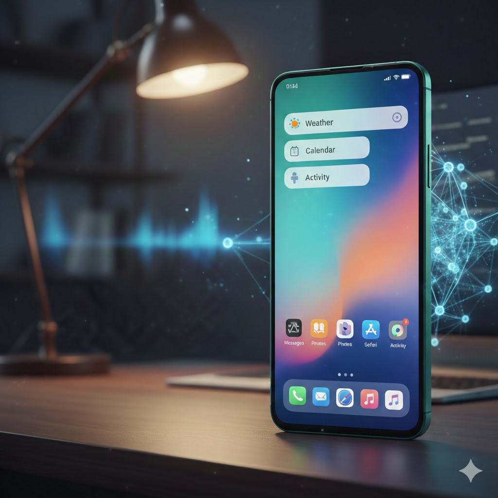
Enter the modern “iOS-ified” skins. Today’s versions of ColorOS, HyperOS, and even OriginOS have moved past being mere copies. They’ve stolen the right things:
- Physics-based animations: Everything bounces and stretches with the same weight as an iPhone.
- Gaussian blur: Done right, it adds a layer of depth that “flat” Android often misses.
- Consistency: The icons, the control center, and the system menus all speak the same language.
When I use these “clones,” the phone feels polished. When I use some “independent” UIs, it feels like I’m using a tool designed by amateurs (I’m looking at you Samsung One UI).
Freedom Without the Friction
The real magic happens when you realize that underneath that “Apple-lite” exterior lies the soul of a beast. This is the ultimate “cheat code” for smartphone enthusiasts:
- The iOS Polish: You get the beautiful control center, the fluid gestures, and the high-quality system animations.
- The Android Freedom: You can still sideload apps, customize your launcher, manage your file system, and use a real back gesture (which, let’s be honest, is still better than iOS’s implementation).
We used to call it “copying.” Now, I call it the best of both worlds.
Conclusion: I have stopped caring about “originality” in UI design. If a manufacturer wants to “borrow” the way iOS handles blur effects or notification stacks, I’m all for it—as long as they keep the Android heart beating underneath. At the end of the day, I don’t use my phone to make a statement about OS purity; I use it because I want a device that feels premium and works exactly how I want it to.
The iOS clones have finally achieved what Stock Android couldn’t: they made the Android experience feel expensive.
What do you think? Does a “copycat” UI ruin the Android experience for you, or is the added polish worth the lack of originality?